One of the most obviously significant outputs of the projection model is the increase in seats for Sinn Féin. The most recent full modelling shows an increase in FPV of 4.8%, but a gain of 25 seats. This gap is due mostly to “missed” seats in the 2020 General Election, where SF ran less candidates than it should have in dozens of constituencies. With a few exceptions (Dublin Central was an obvious error) this was reasonable – SF had been hammered at the prior local elections, and the surge in polling came too late for new candidates to be added to the ballot.
What I’m going to look at here is some of the numbers behind this and where Sinn Féin have room to grow in a real sense, versus where they will merely pick up seats they should have last time.
Below is a map of Sinn Fein’s vote change between the general election in 2016, which was itself their best election since 1923, and 2020. The numbers express the vote increase as a percentage of the 2016 figure (for example, the +100.0 in Limerick County indicates that SF doubled their FPV there from 2016 to 2020).
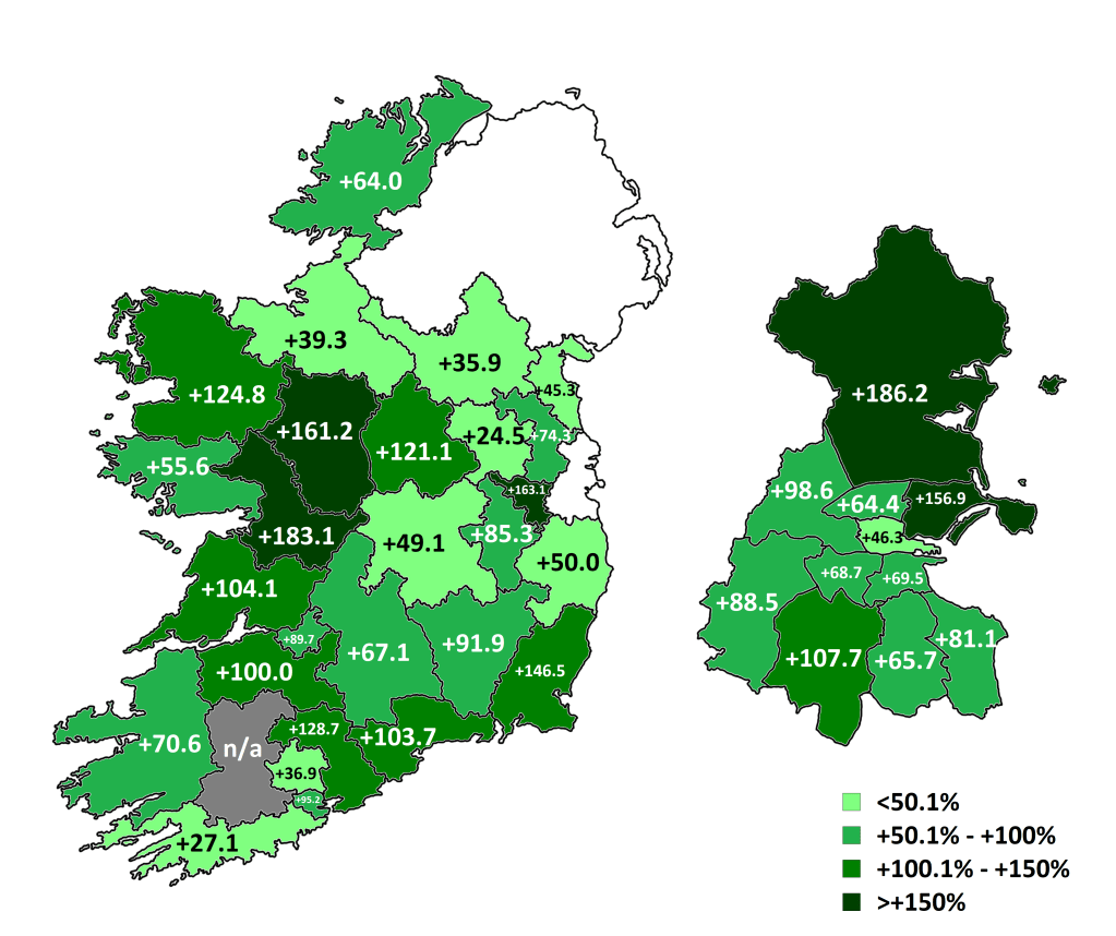
The really notable thing of course about the SF surge is, of course, how broad it was. Every constituency saw a massive increase, and even those where it was relatively lower have mitigating factors, such as already starting from a high base, or outlier rival candidates like Peadar Tóibín (AON) or Holly Cairns (SD).
Of course, even those low swings are honestly staggering when you consider that a 25.4% relative increase in FPV is your worst result.
But sure everyone has at least an idea of geographic breadth of their surge. And there’s more factors than this in modelling things out. For example, consider the below charts, which shows the FPV change in Dublin between the last two general elections, both raw and relative:


The key observation here is that SF votes didn’t just come from the likely sources – where they drew from was relative to the area. Naturally, SF squeezed expected sources, such as Independents, PBP and Labour, which is why to a large extent the model shows an increased number of SF candidates, even with a static FPV, squeezing those groups further.
Of course there’s no way to confirm these votes went directly to SF – it is not likely, for example, that a third of FG voters went directly to SF in DMW (FG to SF transfers are a real thing, albeit not very numerous. Similarly there are a small number of FG to SF swing voters, and there’s polling that supports this. There is something really interesting to be written about some of the more bizarre transfer patterns in Ireland, but that’s for another day), but these do show the net outcome of movement. But apparent oddities in the modelling like the threat to SD Róisín Shortall’s seat in DNW make more sense when you consider that she lost a third of her FPV in 2020 – and it’s quite plausible that the vast majority of those votes went to Dessie Ellis (SF).
That’s a view of what happened, and hopefully some insight into how this kind of change informs the modelling, as the 2020 data is the base that underpins the entire system. But this site is based around projections, so let’s look at what the model thinks for the future. Below is a map of what the model currently projects as FPV for SF in each constituency, with the 2020 vote as the baseline:

Sinn Féin’s support has settled in the high 20s, up from their GE total of roughly 25% but down from their post-election polling, which at one point had them at 35% in three consecutive polls. So far, Fine Gael have been the main beneficiaries of this dip, although again this is unlikely to be a straight support swap, but net support changes filtering through other parties.
What’s immediately striking, in contrast to the 2016-2020 map, there’s a geographic coherence to this. Now, that is doubtlessly to some extent influenced by the use of provincial polling numbers, but it does give us an indication of where there’s actual growth for SF. Overall though, the numbers are fairly flat in recent months – while the surge appears to have stuck and settled at a mark above their election performance, the overall trend since March is pretty flat.
Dublin is more or less maxed out – gains there are reliant on existing votes and missed seats. Indeed SF’s numbers are overall indicating a marginal decline in Dublin, particularly in the three south-eastern constituencies, which are among the toughest in the country for them anyway. For SF to build here they need to find a way to make greater inroads into new areas (I would again recommend Ian Richardson’s tally mapping, which clearly shows the stark in-constituency geographical divides). Otherwise, the model’s current projection for them, 18 seats in Dublin, behind FG, is as good as it’s ever going to get for them.
On the flipside of this, there are two areas showing significant room for growth. The first of these, as mentioned elsewhere, is Munster. Sinn Féin underperformed here relative to other provinces in 2020, taking around 19.1% of FPV. An RPA of polls pre-GE 2020 correctly projects this, so the upwards movement here doesn’t appear to be a correction of an error but a genuine increase in support. This is fertile ground for SF, and should there be a continuation of the surge, or even a building on it, these constituencies are the ones that could put the party over the top.
The second area is Roscommon-Galway. This is a bit of a regional outlier, but it’s interesting as to why it comes up. The model currently has independents being crushed, and with such a heavy IND vote in the constituency, it thinks SF will fill the gap. Given who the two Independents there are this remains to be seen, but Claire Kerrane’s votes didn’t come from nowhere last time.
Finally, I think SF might be being overestimated by the model in RoL. It’s just a feeling at this point but their polling in the province looks odd to me, and this warrants further examination of the figures and constituency movements.
If you prefer graphs to maps, here’s what the provincial polls say for SF, reflected in the above analysis.


